|
Logo Use
The information found below and contained within the accompanying PDF file form the officially published guidlines for the use of the Specialist Aggregates Limited Logo. The guidelines listed should be followed for both print and web communications.
Due to some differences between print and web communications, some of the guidelines have been modified for web use accordingly.

A PDF copy of these guidelines
can be downloaded here.
- The logo should use only the “official” logo colors listed on this page.
- Any scaling must retain the original proportions of the logo.
- Other than the variations listed on this page, the logo may not be modified in any way.
- Additional text may not be added in such a way that it appears to be part of the logo itself.
RED
Pantone -
Hex -
HSB -
RGB -
CMYK -
202c
8B2331
351° - 75% - 54%
139 - 35 - 49
29% - 96% - 76% - 29%
GREY
Pantone -
Hex -
HSB -
RGB -
CMYK -
Warm Grey 3
C1B7AF
25° - 9% - 75%
193 - 183 - 175
25% - 24% - 28% - 0%
Logo Variation
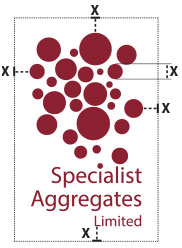
Exclusion Zone

Make sure that text or other design elements do not encroach upon the logo.
The marked space should always be given to let the logo ‘breathe’, free from distraction.
Minimum Reproduction Size

For ideal legibility, the minimum reproduction width of the Specialist Aggregates Limited logo is:-
Print at 300dpi - 0.8 inch / 22 mm.
Web use at 72dpi - 62px
|